Dashboards
A user guide for working with dashboards. We cover how to create and modify dashboards.
This section focuses on managing user dashboards.
Clicking on Dashboards grants access to the list of a user’s dashboards.
Overview
Dashboards are collections of components designed to monitor the status of the platform. You can create dashboards for specific objectives or to display particular information. There are two types of dashboards.
| Type | Description |
|---|---|
User | Dashboards that users can create themselves, using the available components. |
User Type | Read-only dashboards created for specific user types. These dashboards are used to share fixed information among all users of a certain user type and can help ensure everyone is reporting the same data. |
Configure User Type Dashboards
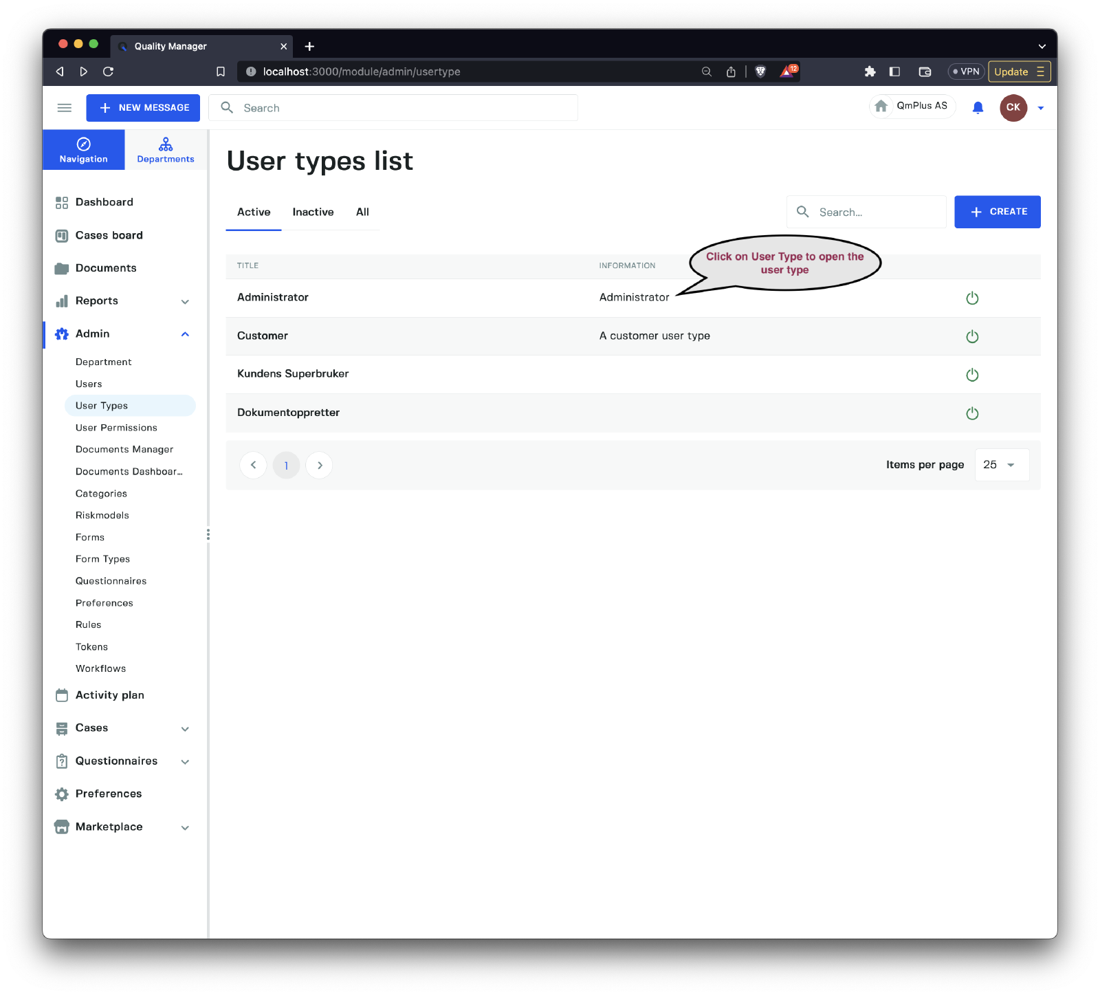
To create or modify User Type dashboards, first navigate to the User Types list. Click on one of the User Types to open the User Type, and then click on the Dashboards tab.
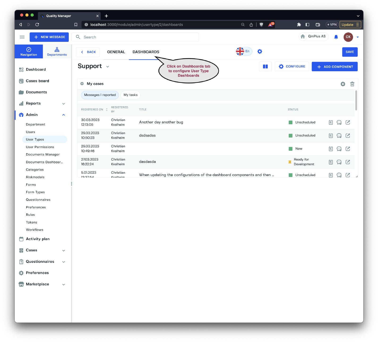
Dashboards configured here will be displayed for users of that User Type when they click on the Dashboards menu option.
Dashboard
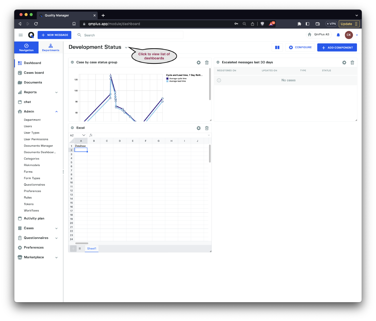
Above is an example of a dashboard with some configured components.
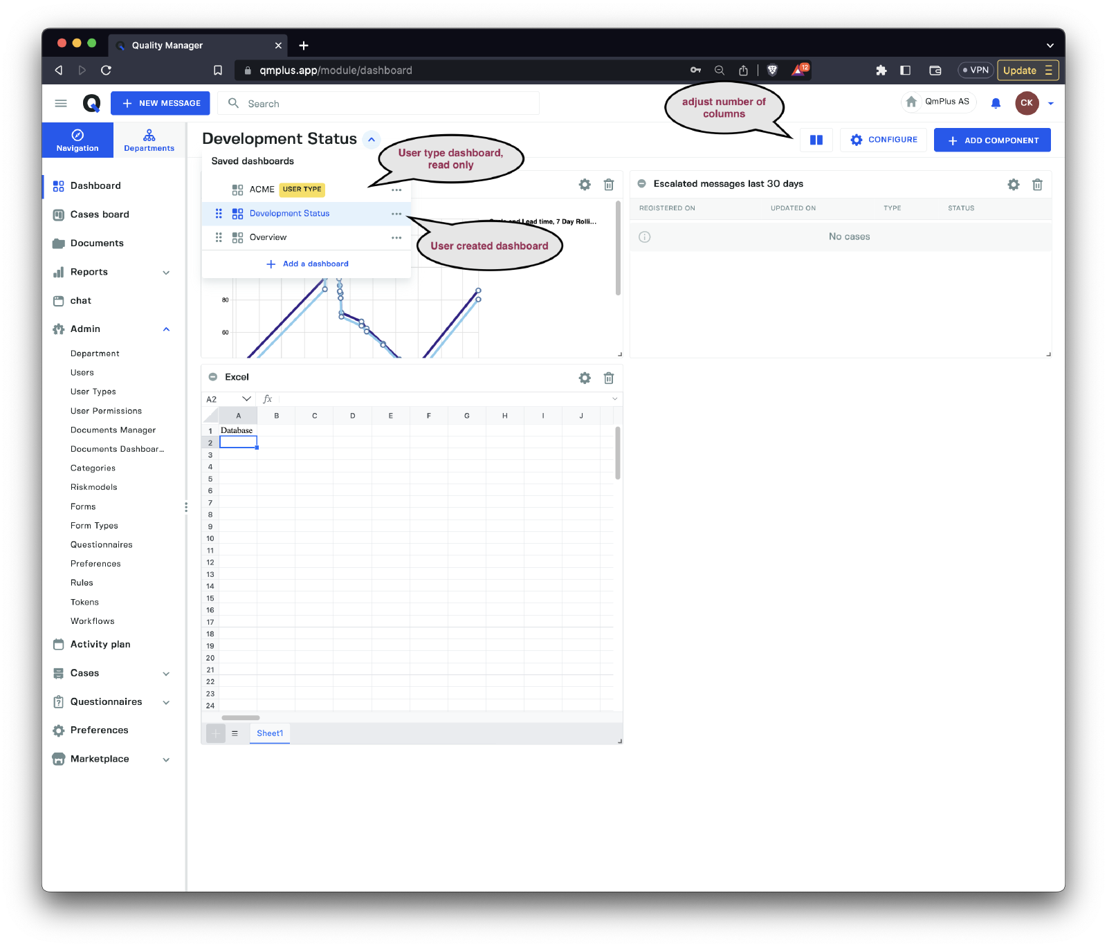
There are two types of dashboards.
| Type | Description |
|---|---|
Usertype | A read-only dashboard specified for the logged-in user’s user type. Can be used to ensure uniform reporting of numbers and status. |
User created | A dashboard created by the logged-in user. |
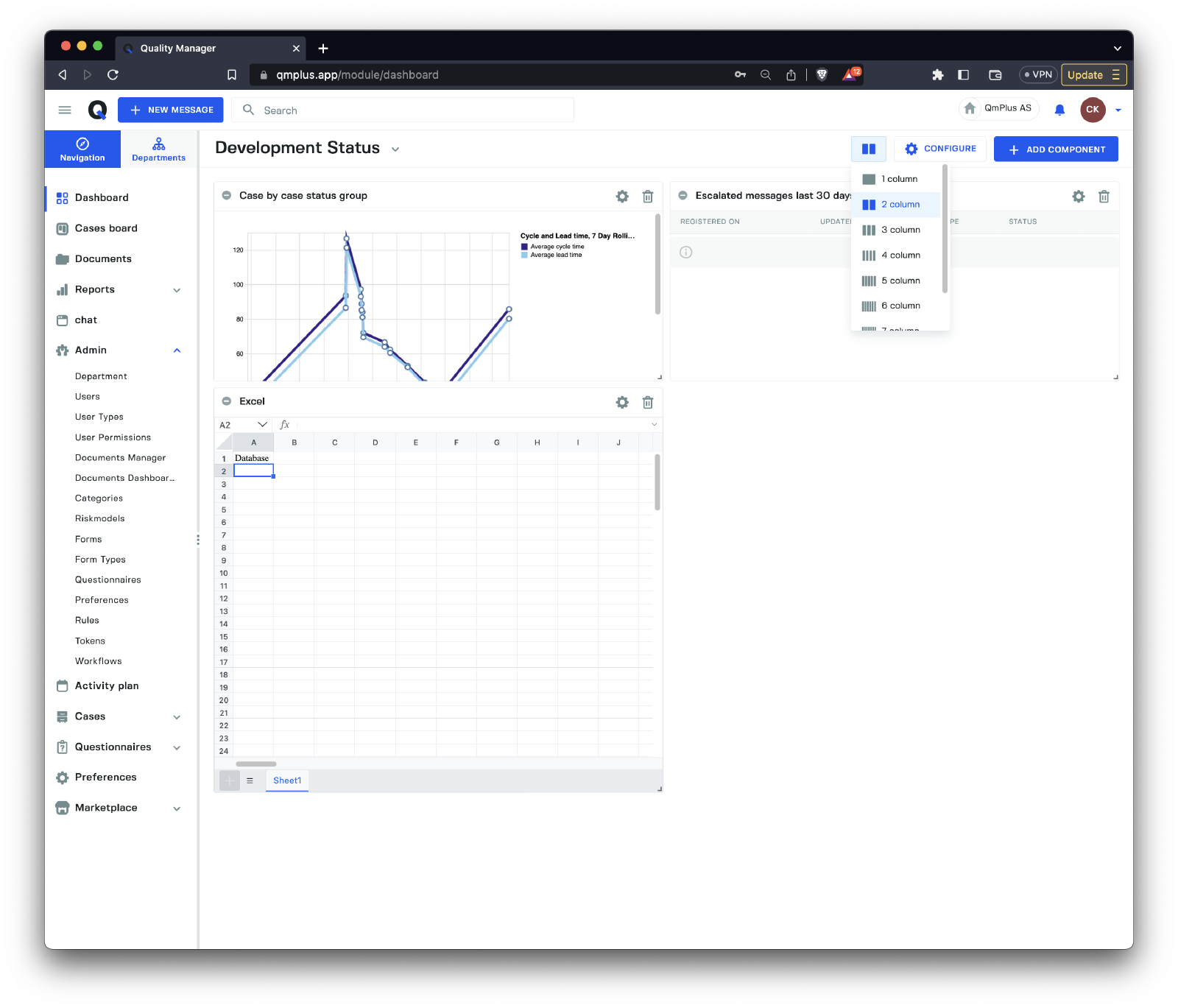
By clicking on the Columns symbol, you can adjust the number of columns used to render the dashboard, allowing for more precise control of the component layout.
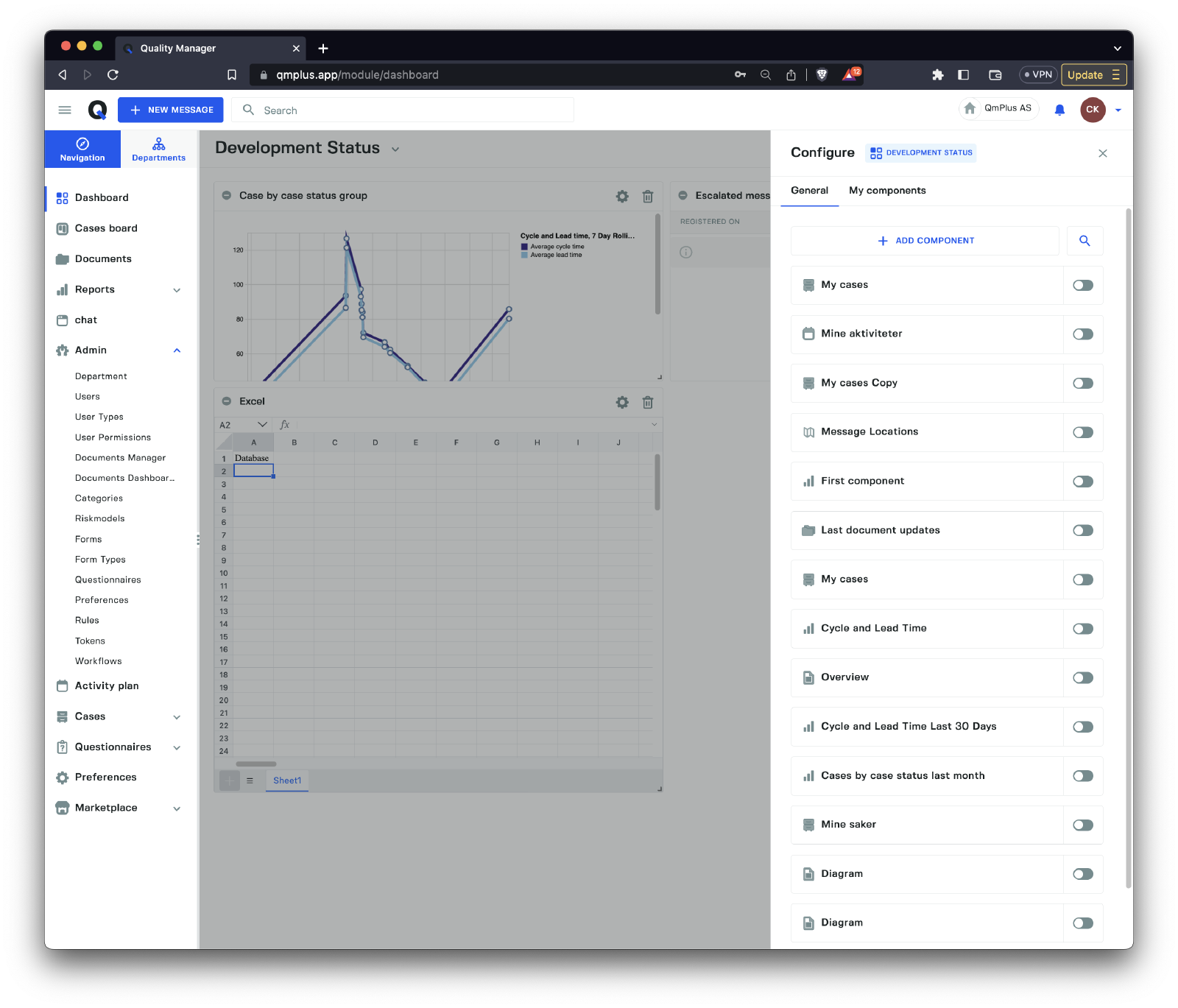
By clicking the Configure button on the dashboard, you gain access to saved existing components that can be reused. These components come in two types.
| Type | Description |
|---|---|
General | Components shared across the entire organization and available for all users to create. The user must have permission to create general components to be able to create new components here. |
My components | Components that the logged-in user has already created and are only visible to them. |
Components
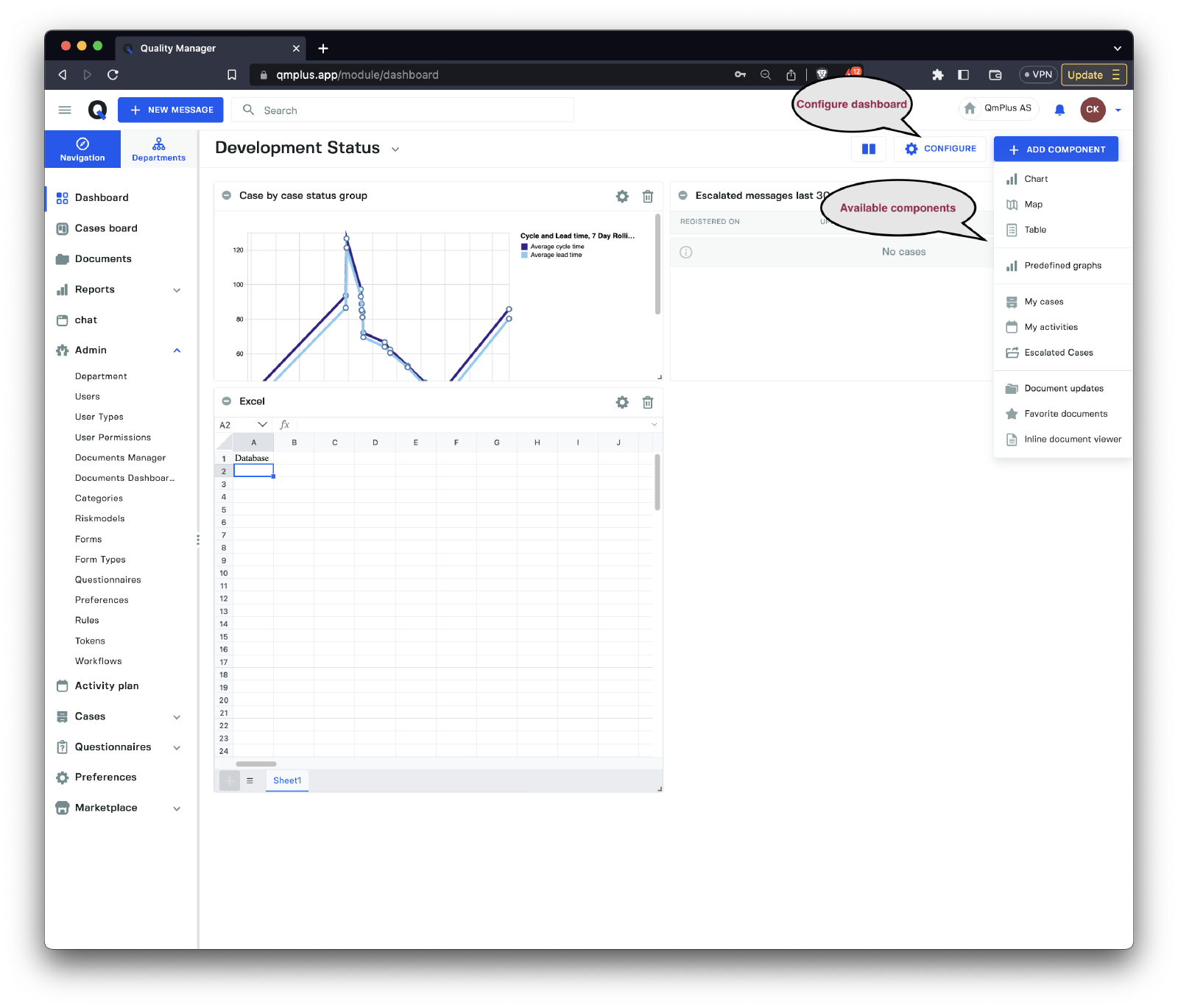
There are several components available to add to a dashboard. These can be used to construct information dashboards for end users or for yourself.
Chart
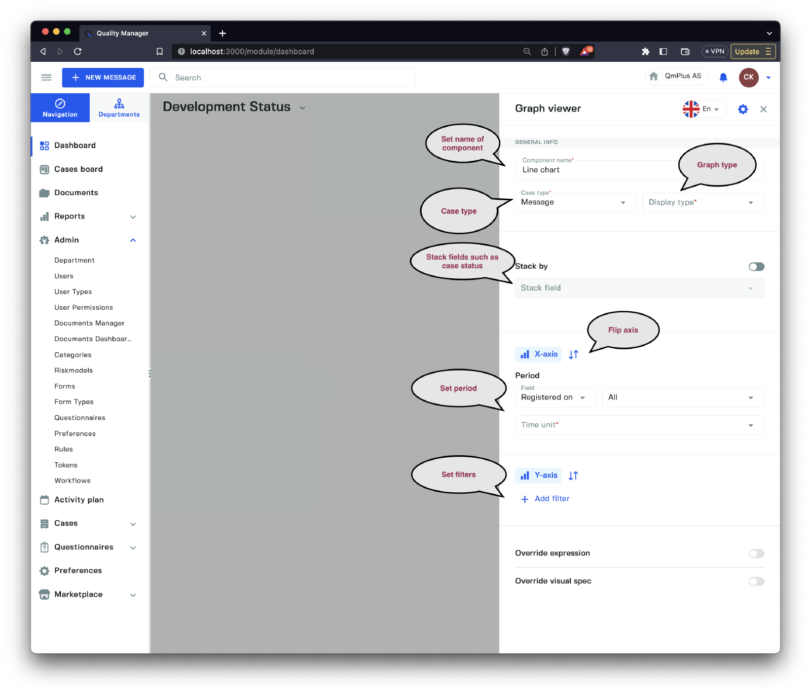
Charts allow you to create components that visualize data stored in Q. Let’s examine the available options.
| Option | Description |
|---|---|
Component name | Set the name of the component, supporting multiple languages. |
Case type | Select the case type for the graph. This can be Message, Action, Document, Hearing, or Audit. |
Display type | Choose the display type for the graph. This can be a Line chart, Area chart, Bar chart, or Pie chart. |
Stack by | Enable/Disable the stack by field option for the graph. |
Stack field | Select the field to stack by. See the table below. |
X-axis | Select the options for the x-axis (x-axis and y-axis can be flipped). |
Y-axis | Select the options for the y-axis (x-axis and y-axis can be flipped). |
Period | Choose the time period of the graph data. The available fields depend on the case type. |
Filters | Add, remove, and modify filters to limit the results returned for the graph. |
Override expression | Allows the end user to override the query language run against the Q backend. |
Override visual spec | Enables the end user to override the VegaLite graph definition used to render the graph. |
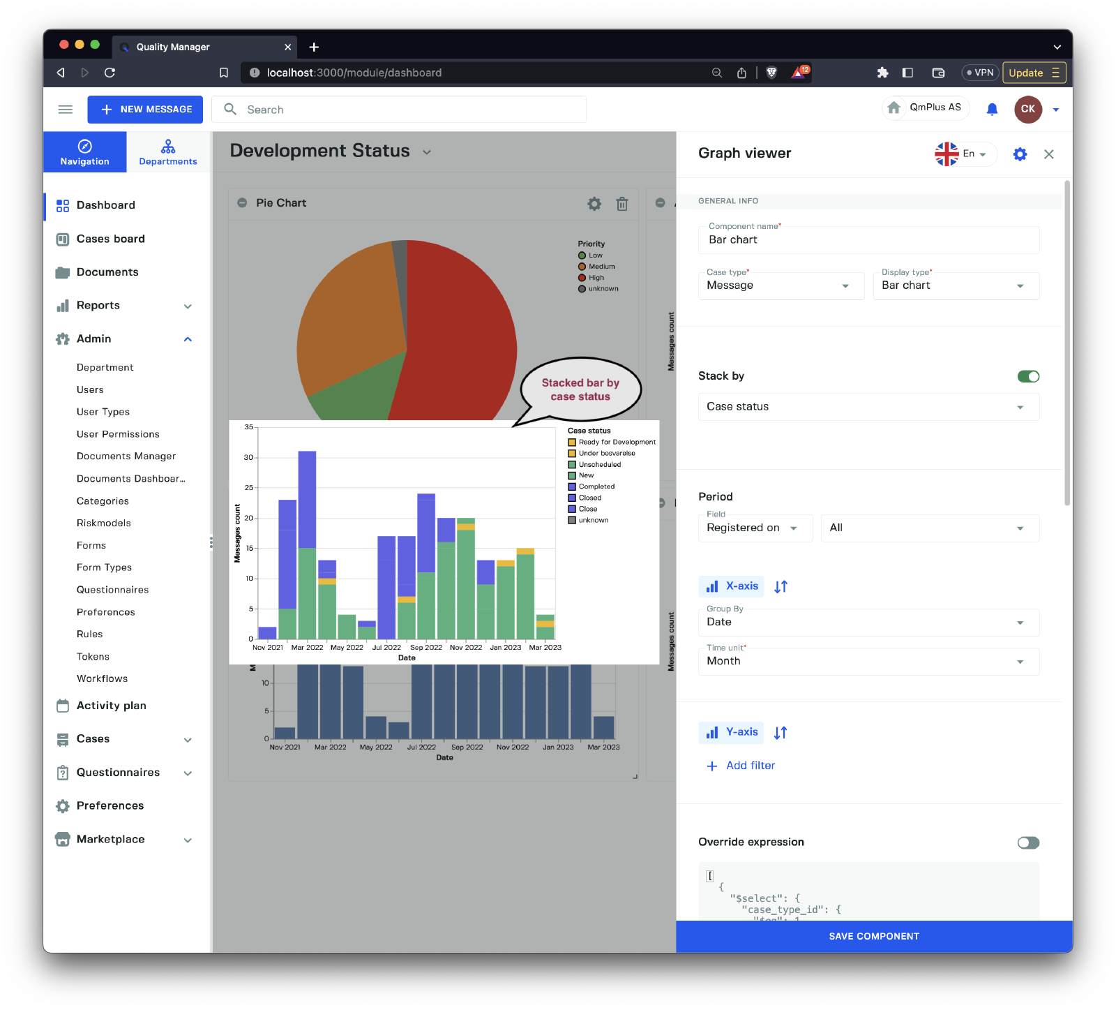
The available stack by fields are:
| Field | Description |
|---|---|
Priority | Stack by priority level of the case. |
Case status | Stack by the case status of the case. |
Department | Stack by department of the case. |
Form | Stack by the form of the case. |
Map
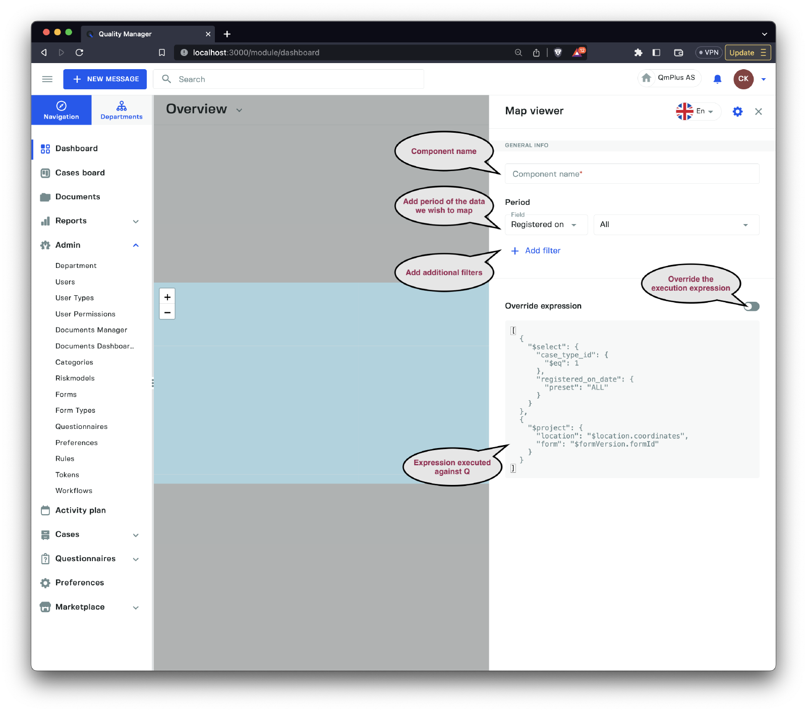
The map component allows you to create a query that will be mapped to a map instance if the message case has associated geo coordinates.
Table
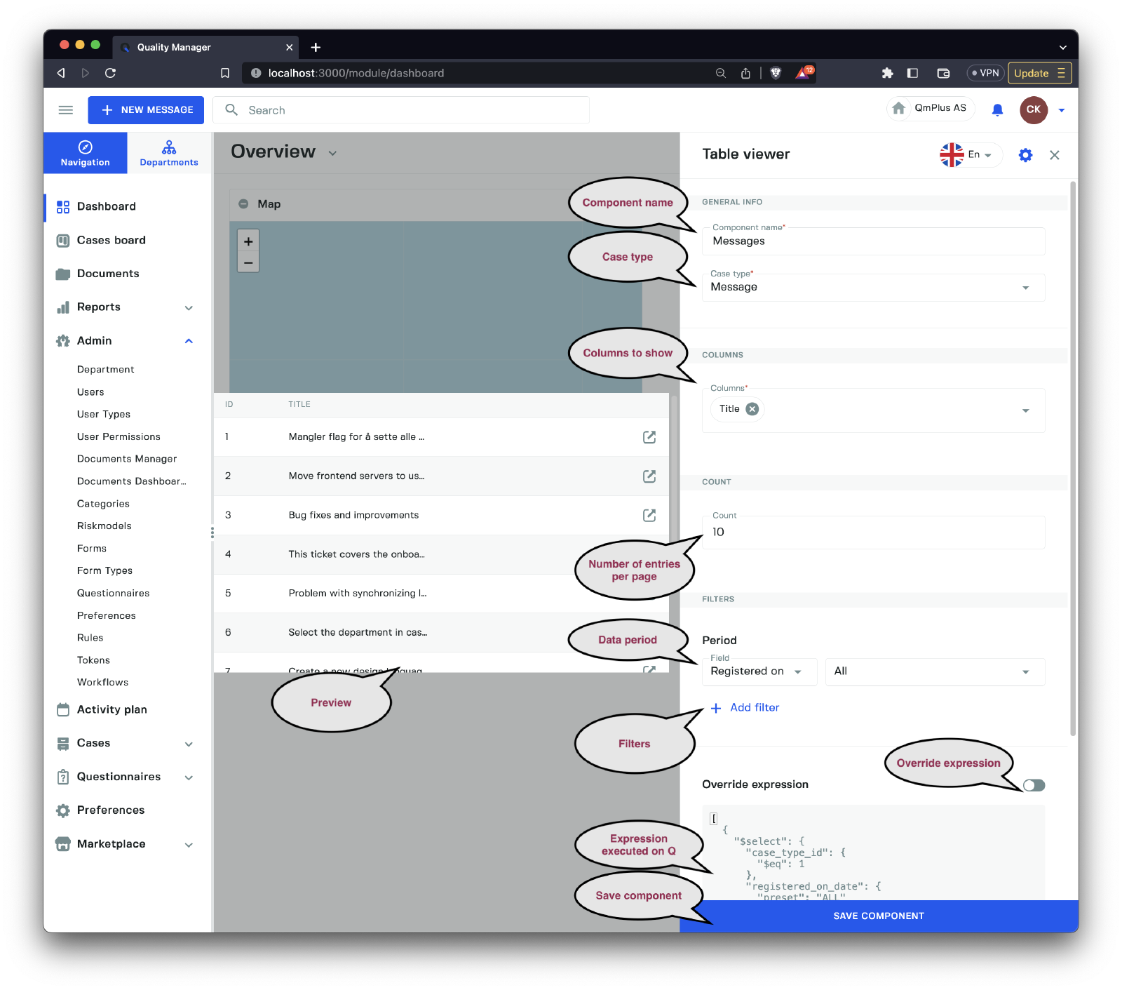
The table component is a list component that displays the results of a specific query. Here’s an overview of the options:
| Option | Description |
|---|---|
Component name | Set the name of the component, supporting multiple languages. |
Case type | Select the case type for the graph. This can be Message, Action, Document, Hearing, or Audit. |
Columns | Choose the columns visible in the list results. |
Count | Select the number of entries per page in the list. |
Period | Choose the date period for the entries in the list. |
Filters | Add, remove, and update filters for the query. |
Override expression | Override the current generated expression. |
Predefined graphs
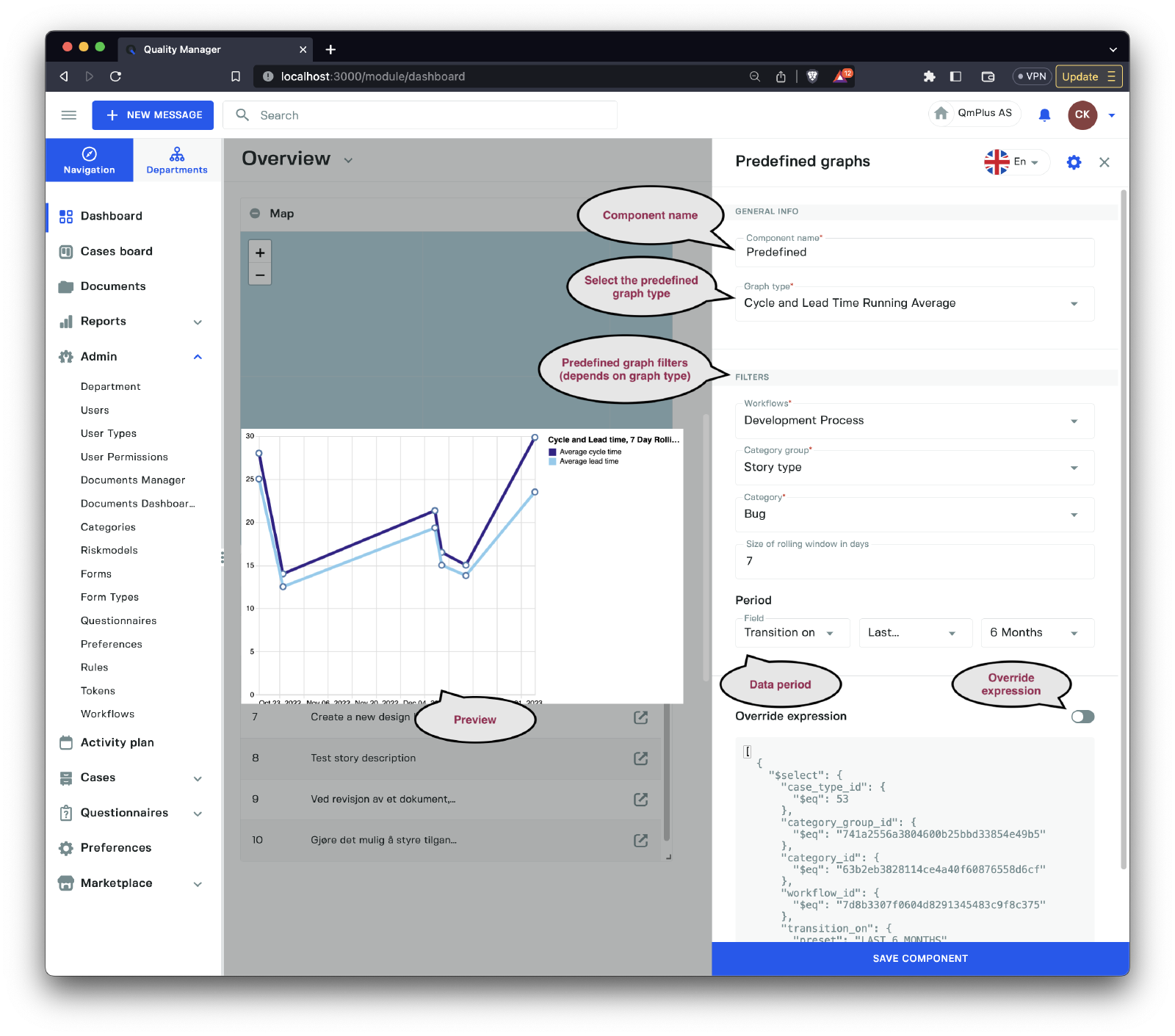
Predefined graphs are pre-made (canned) reports that you can use to target specific analytic goals. Let’s examine the fields of the sidebar.
| Field | Description |
|---|---|
Component name | Set the name of the component, supporting multiple languages. |
Graph type | Select the predefined graph type, see the table below. |
Filters | A set of filters that will vary depending on the predefined graph type the user selects. |
Period | Select data for the report by time period. |
Override expression | Enable/disable the ability to override the expression being sent to Q. |
The available predefined graphs are:
| Predefined Graph | Description |
|---|---|
Cycle and Lead Time Running Average | Measure the cycle and lead time over a window of running average. See the definition of Cycle and Lead time below. |
Case by case status group | The count of cases over time by case status group. |
Cases by case status | The count of cases over time by case status. |
Unprocessed vs Open and Closed cases | Number of cases unprocessed, open, and closed over time. |
Time spent in case status group by percentile | Time a case spends in each case status group (setting the percentile, for definition of percentile see below). |
Time spent in case status by percentile | Time a case spends in each case status (setting the percentile, for definition of percentile see below). |
Cumulative count of cases by department | Cumulative count of cases per department. |
Cumulative cost of cases by department | Cumulative cost of cases per department. |
Definitions
Cycle time refers to the average time taken to complete a single unit. The Lead Time refers to the length of time it takes from the date of receipt of an order to the date of delivery.
Percentile, expressed as the percentage of values in a set of data scores that fall below a given value. That is to say that if you set the percentile to 90% and you get a value 100, it means 90% of the results in your data set fall below 100.
Cycle and Lead Time Running Average Filters
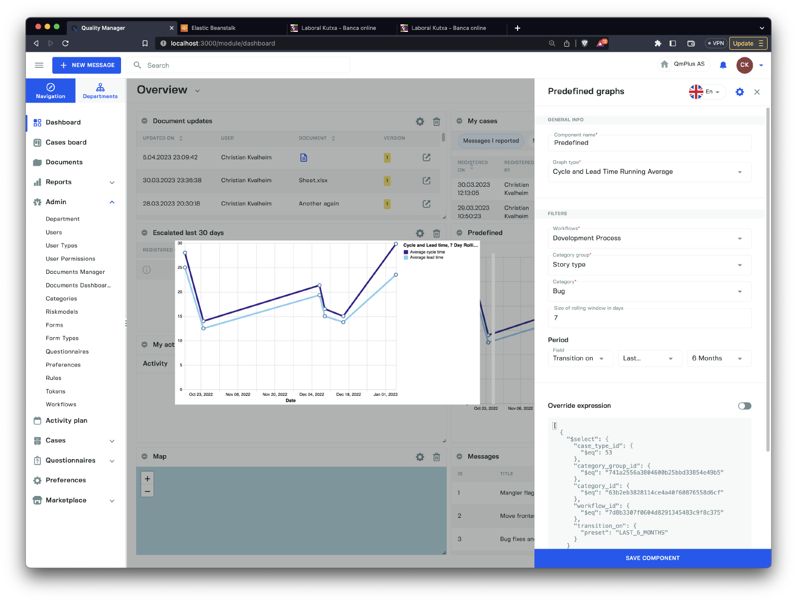
The filters available for the Cycle and Lead Time Running Average predefined graph type are:
| Field | Description |
|---|---|
Workflow | Select the workflow to report on. |
Category group | Select the category group you wish to use to filter the results. |
Category | Select the category in the category group to use for filtering. |
Size of the rolling window in days | The size of the rolling window (we recommend 7 days). |
Case by case status group Filters
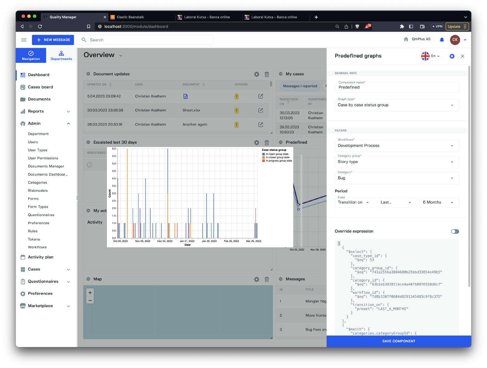
The filters available for the Case by case status group predefined graph type are:
| Field | Description |
|---|---|
Workflow | Select the workflow to report on. |
Category group | Select the category group you wish to use to filter the results. |
Category | Select the category in the category group to use for filtering. |
Cases by case status Filters
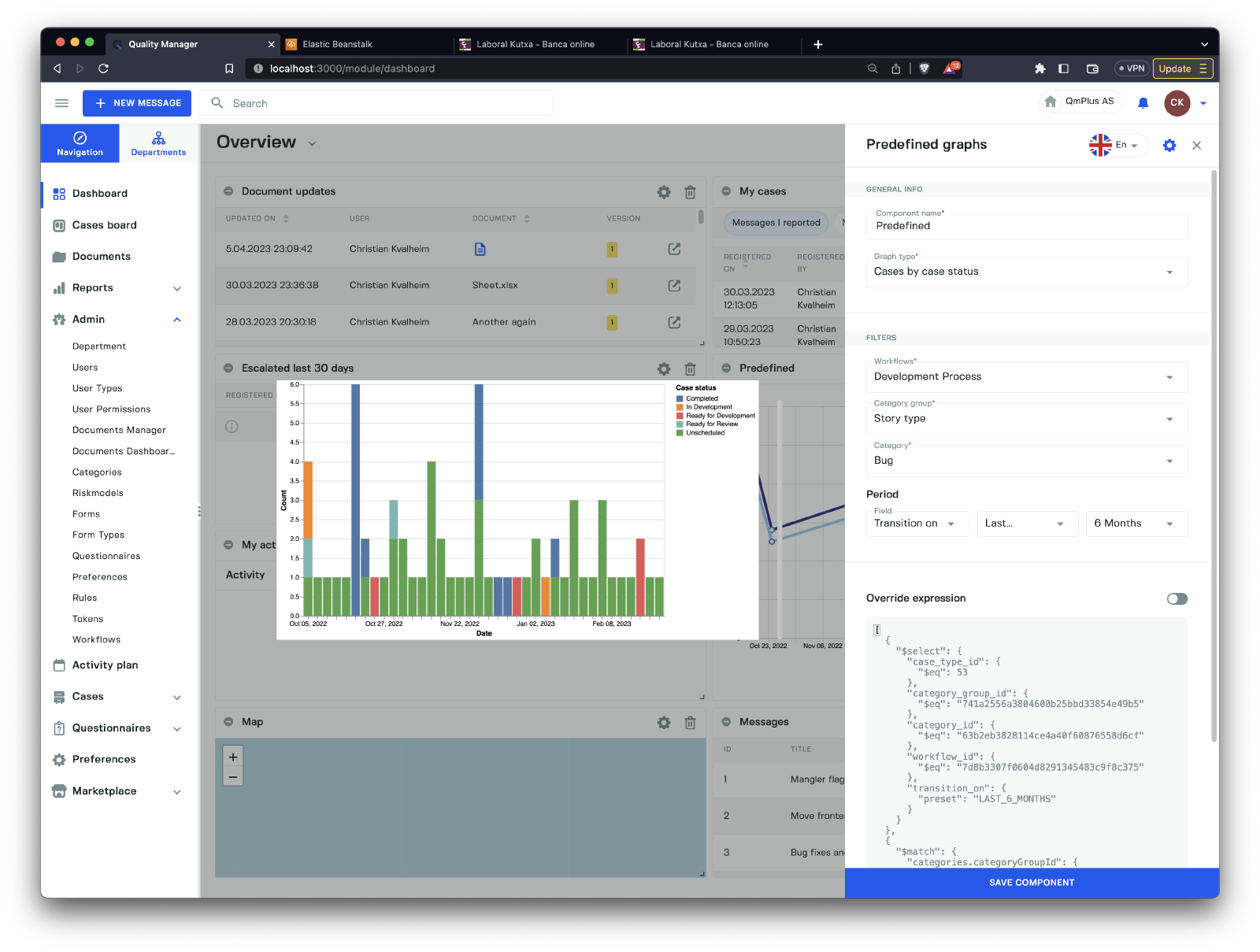
The filters available for the Cases by case status predefined graph type are:
| Field | Description |
|---|---|
Workflow | Select the workflow to report on. |
Category group | Select the category group you wish to use to filter the results. |
Category | Select the category in the category group to use for filtering. |
Unprocessed vs Open and Closed cases Filters
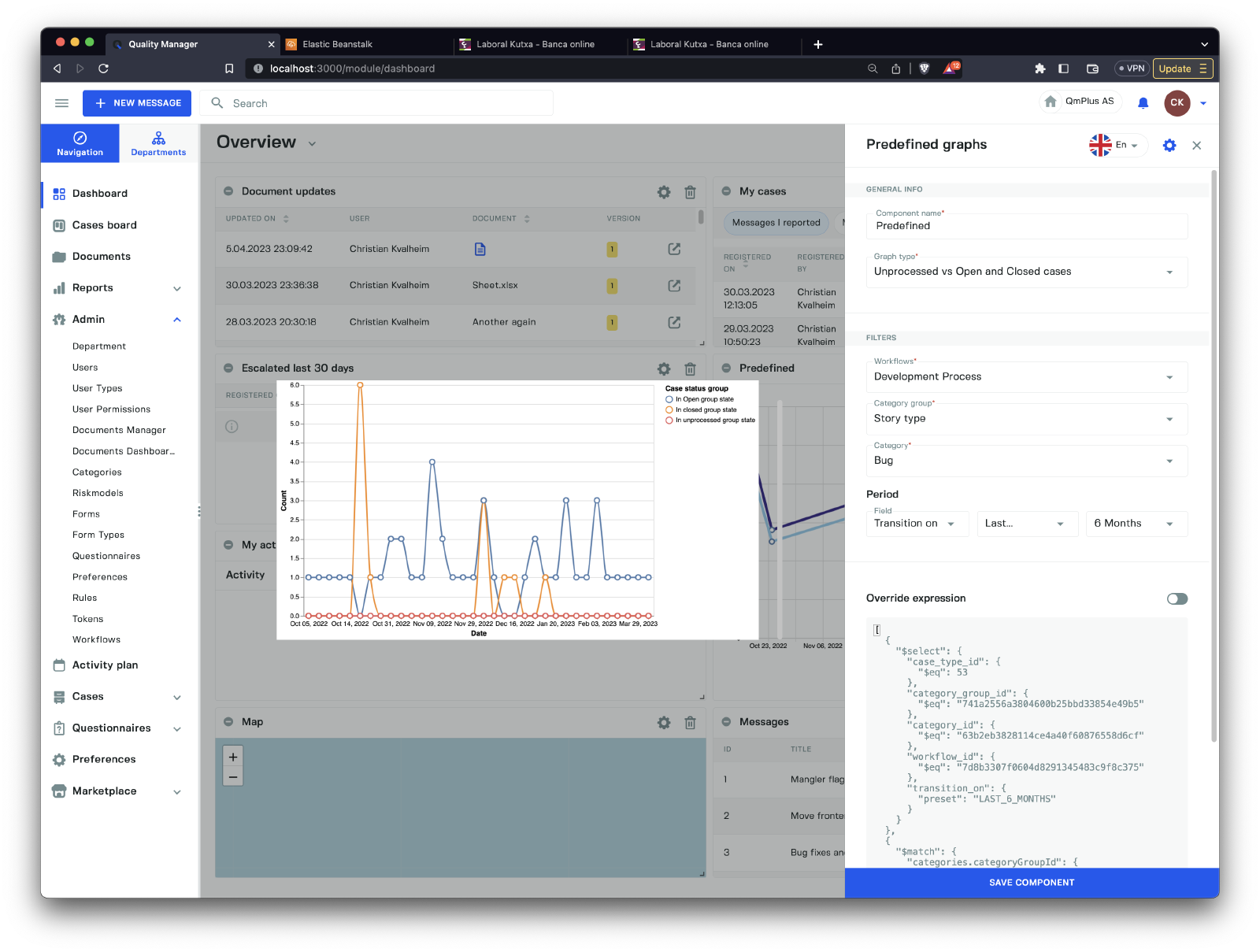
The filters available for the Unprocessed vs Open and Closed cases predefined graph type are:
| Field | Description |
|---|---|
Workflow | Select the workflow to report on. |
Category group | Select the category group you wish to use to filter the results. |
Category | Select the category in the category group to use for filtering. |
Time spent in case status group by percentile Filters
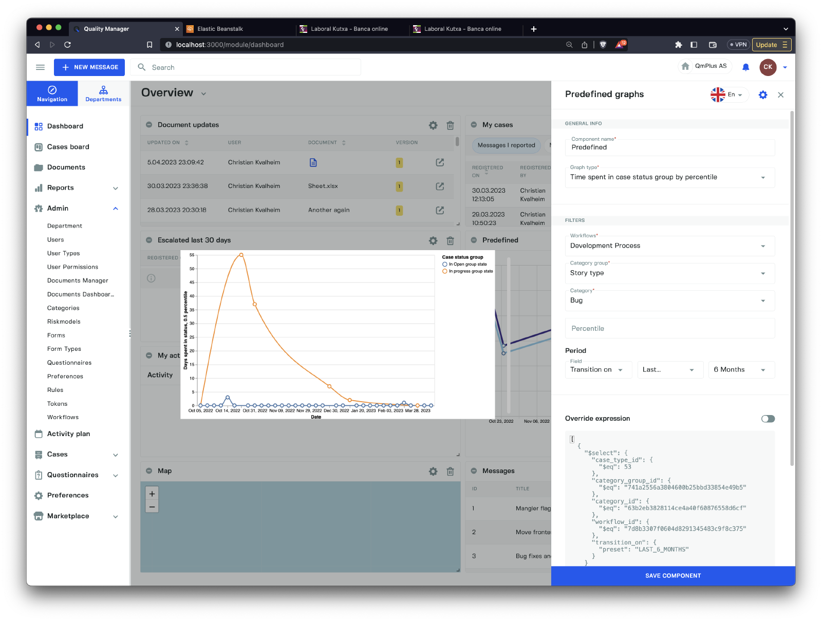
The filters available for the Time spent in case status group by percentile predefined graph type are:
| Field | Description |
|---|---|
Workflow | Select the workflow to report on. |
Category group | Select the category group you wish to use to filter the results. |
Category | Select the category in the category group to use for filtering. |
Percentile | The percentile used to calculate the time spent. |
Time spent in case status by percentile Filters
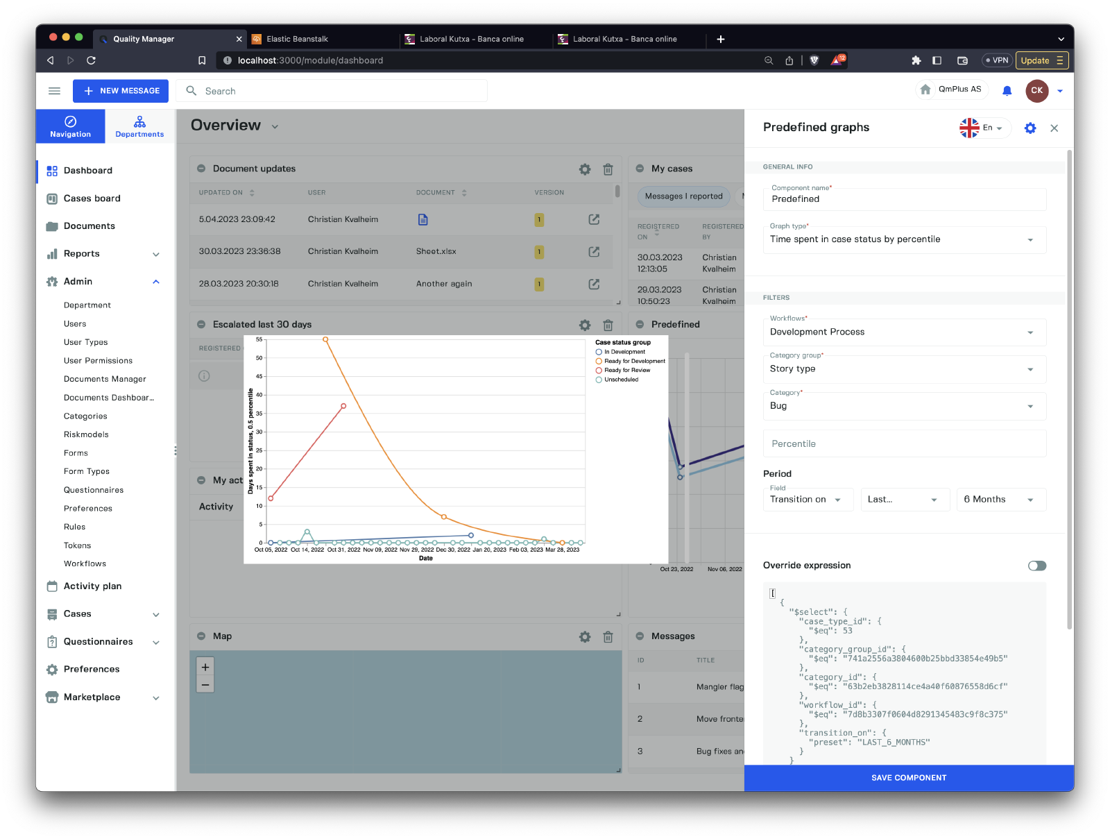
The filters available for the Time spent in case status by percentile predefined graph type are:
| Field | Description |
|---|---|
Workflow | Select the workflow to report on. |
Category group | Select the category group you wish to use to filter the results. |
Category | Select the category in the category group to use for filtering. |
Percentile | The percentile used to calculate the time spent. |
Cumulative count of cases by department Filters
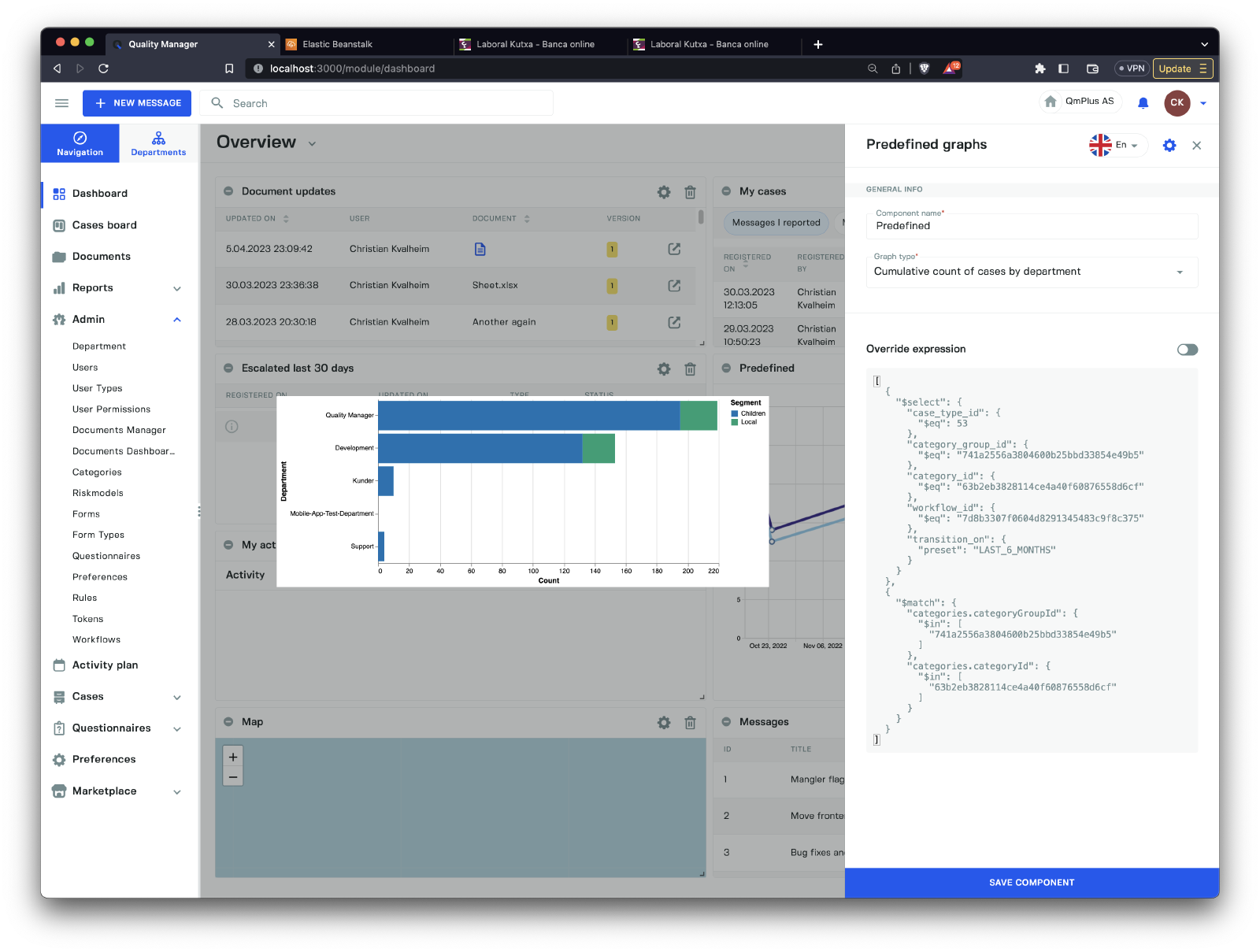
There are no filters available for the Cumulative count of cases by department predefined graph.
Cumulative cost of cases by department Filters
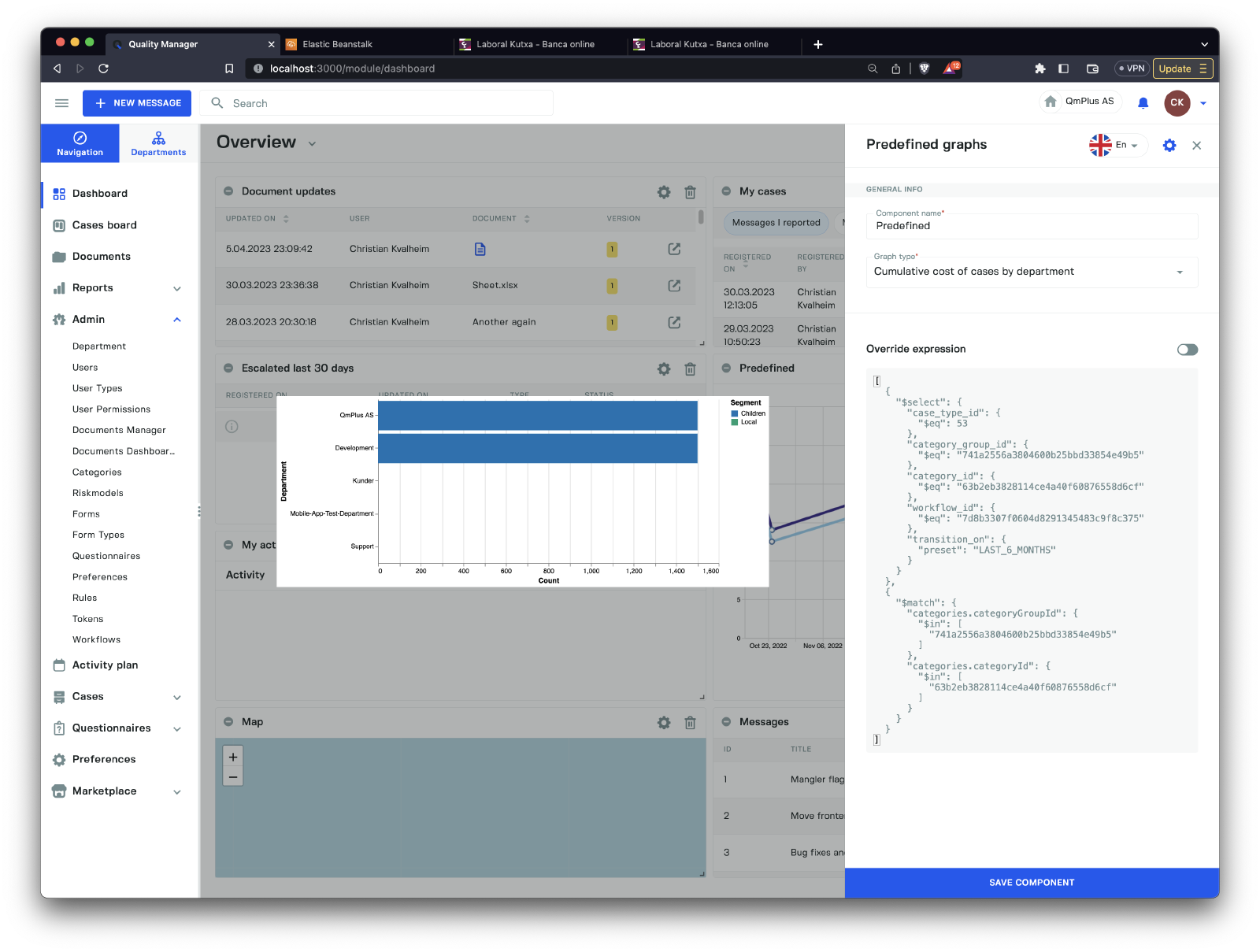
There are no filters available for the Cumulative cost of cases by department predefined graph.
My cases
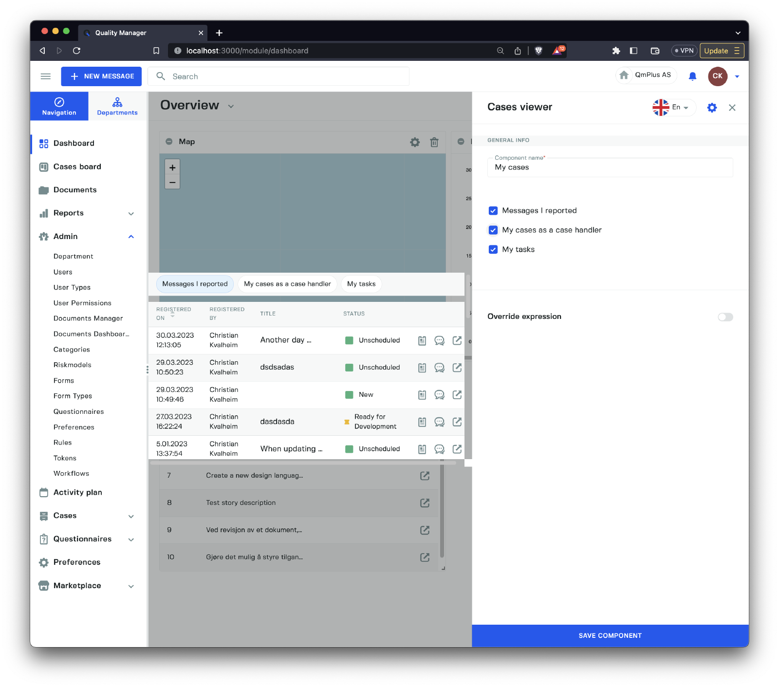
The My cases component provides you with information related to the current logged-in user. There are three tabs.
| Tab | Description |
|---|---|
Messages I reported | Messages I entered into the platform. |
My cases as a case handler | All the cases I’m assigned to as a case handler. |
My tasks | All my assigned tasks on cases. |
My activities
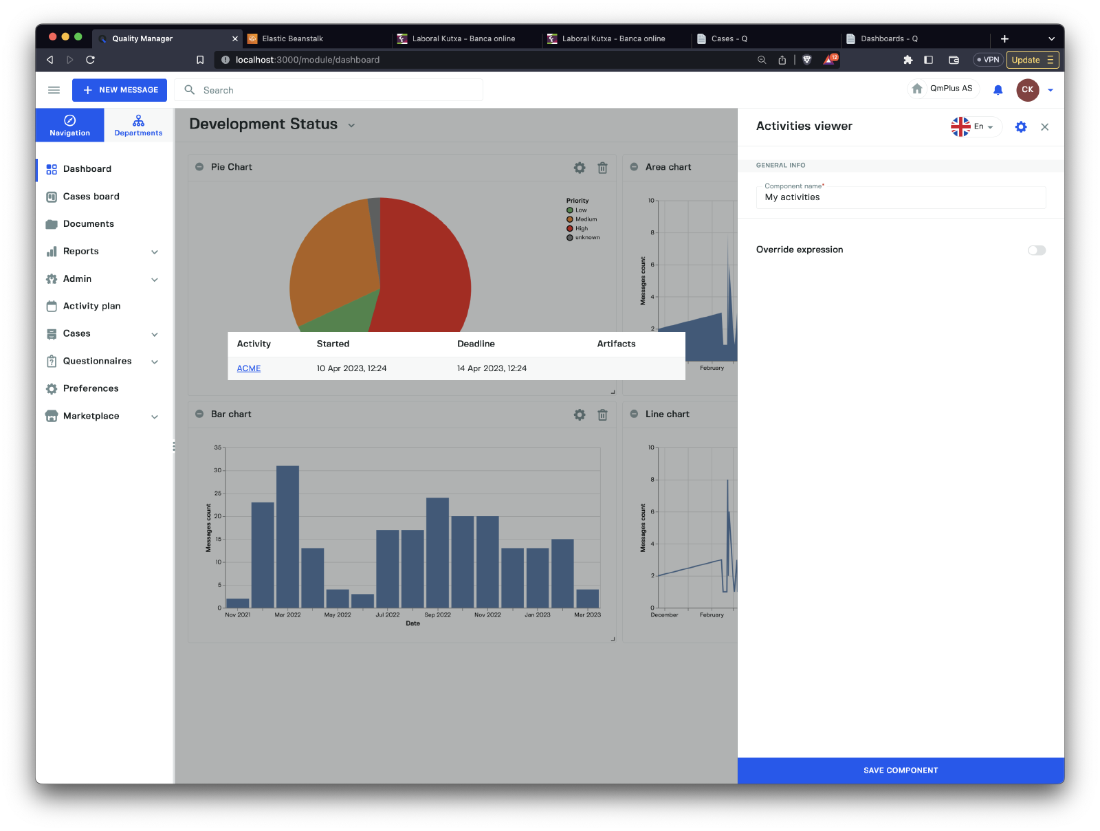
The My activities component displays all upcoming activities associated with the current logged-in user. Users can directly access any given activity by clicking the link for each row.
Escalated Cases
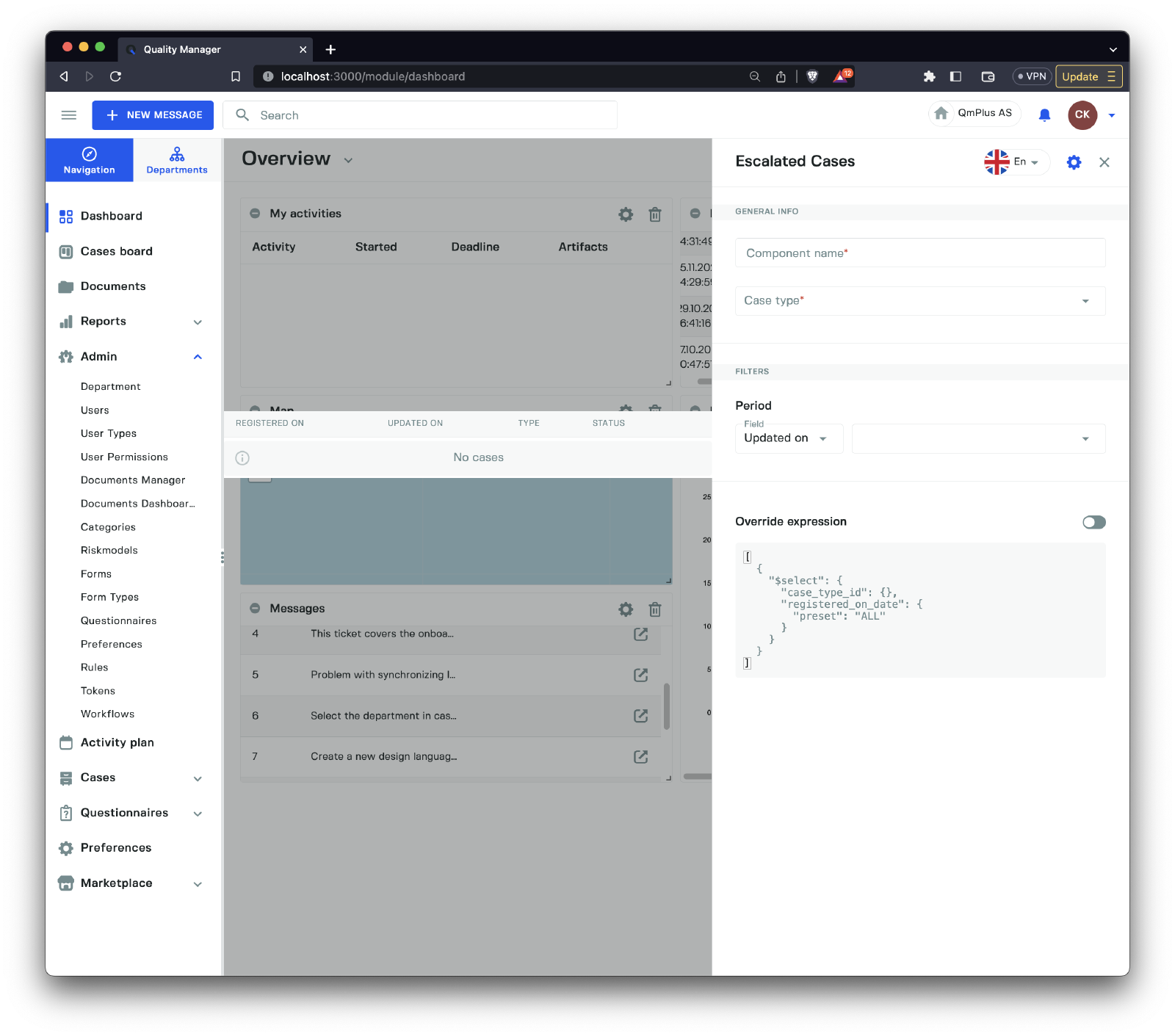
The Escalated cases component shows all the cases that have been escalated by the system within the period specified in the filters. This allows the logged-in user to view and operate on the escalated cases.
Document updates
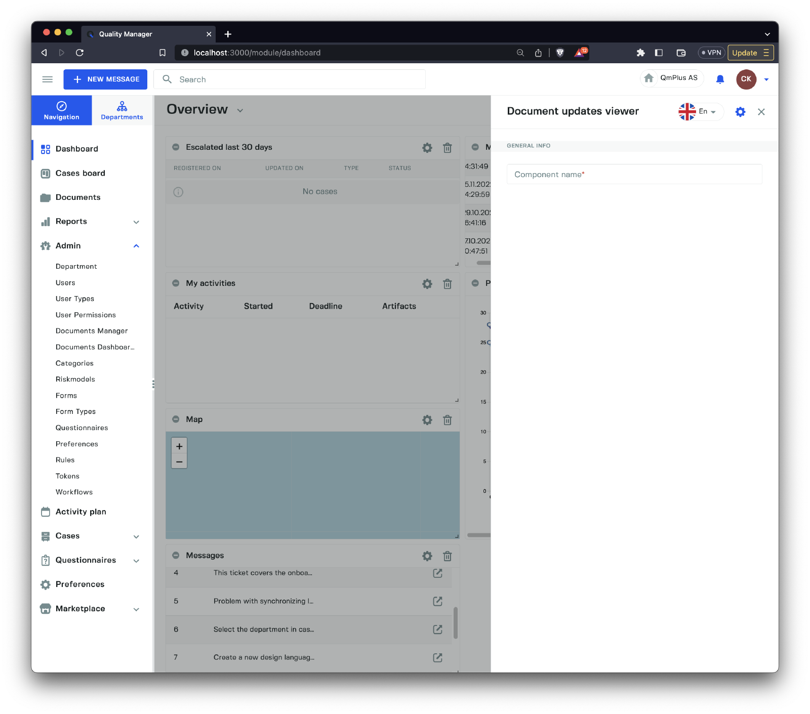
The Document updates component enables the logged-in user to see which documents have been updated within the period specified by the filters in the component settings. For example, this might show all updated documents in the last 7 days.
Favorite documents
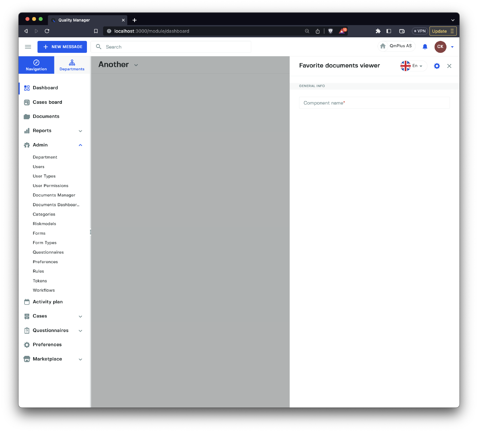
The Favorite documents component displays all the documents favorited by the currently logged-in user.
Inline document viewer
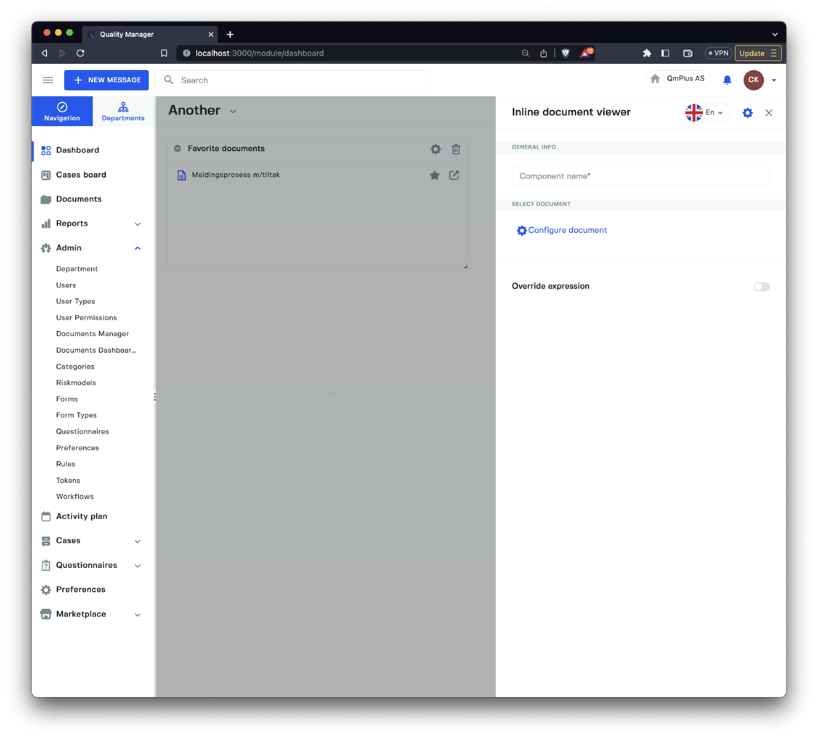
The Inline document viewer component allows you to embed a document directly in the dashboard as viewable content. The following types of document types are supported:
| Type | Description |
|---|---|
Text Document | An HTML-like document viewed in the component. |
Process chart | A process chart document rendered in the component. |
Richtext | A read-only rich text document stored in Q. |
Spreadsheet | A read-only spreadsheet stored in Q. |
All
Inline documentdocuments areREAD ONLYand cannot be edited.