Reports
A user guide for working with reports.
This section deals with creating and updating reports.
Clicking on the reports gives access to the list of the reports available.
Reports let you build reports of data in Q that can be used to monitor and report on statistics of the data collected.
There are two categories of reports in the system.
| Type | Description |
|---|---|
Normal Reports | Normal reports consist of graphs and predefined canned graphs. |
Risk Reports | Risk reports are made up of risk report elements. |
All reports update when you change the
departmentin the navigator, allowing you to drill down into the data and compare data across departments.
Case Report List
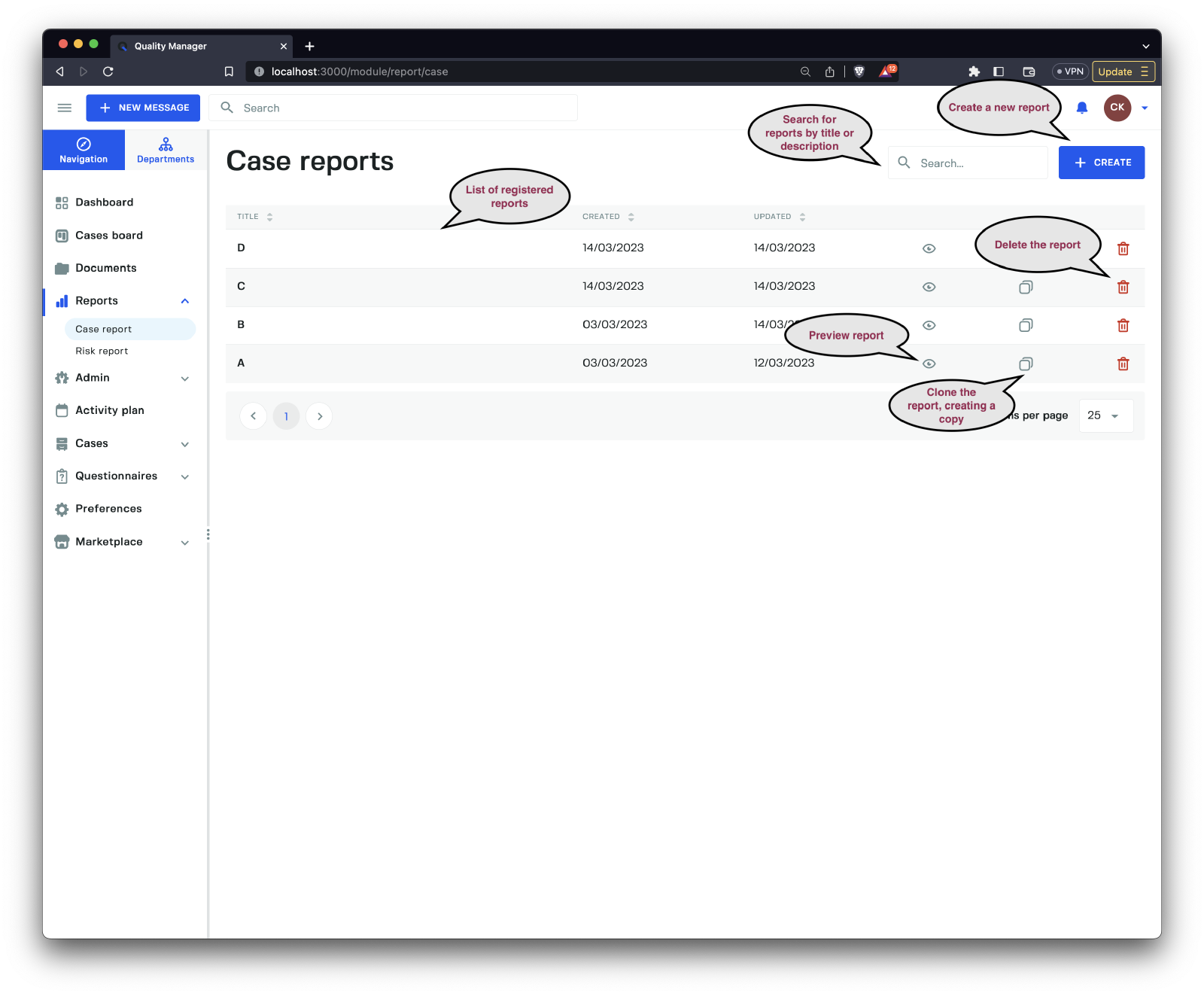
Clicking the Case Report link brings you to the list of Case Reports in the system.
Preview
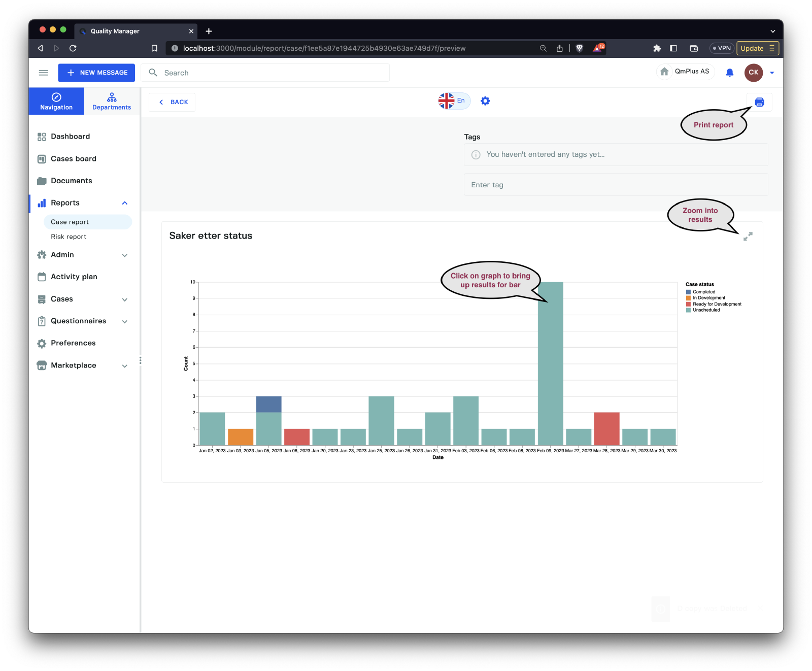
Clicking on the Preview (eye symbol) in the list will bring up a preview of the report in read-only mode.
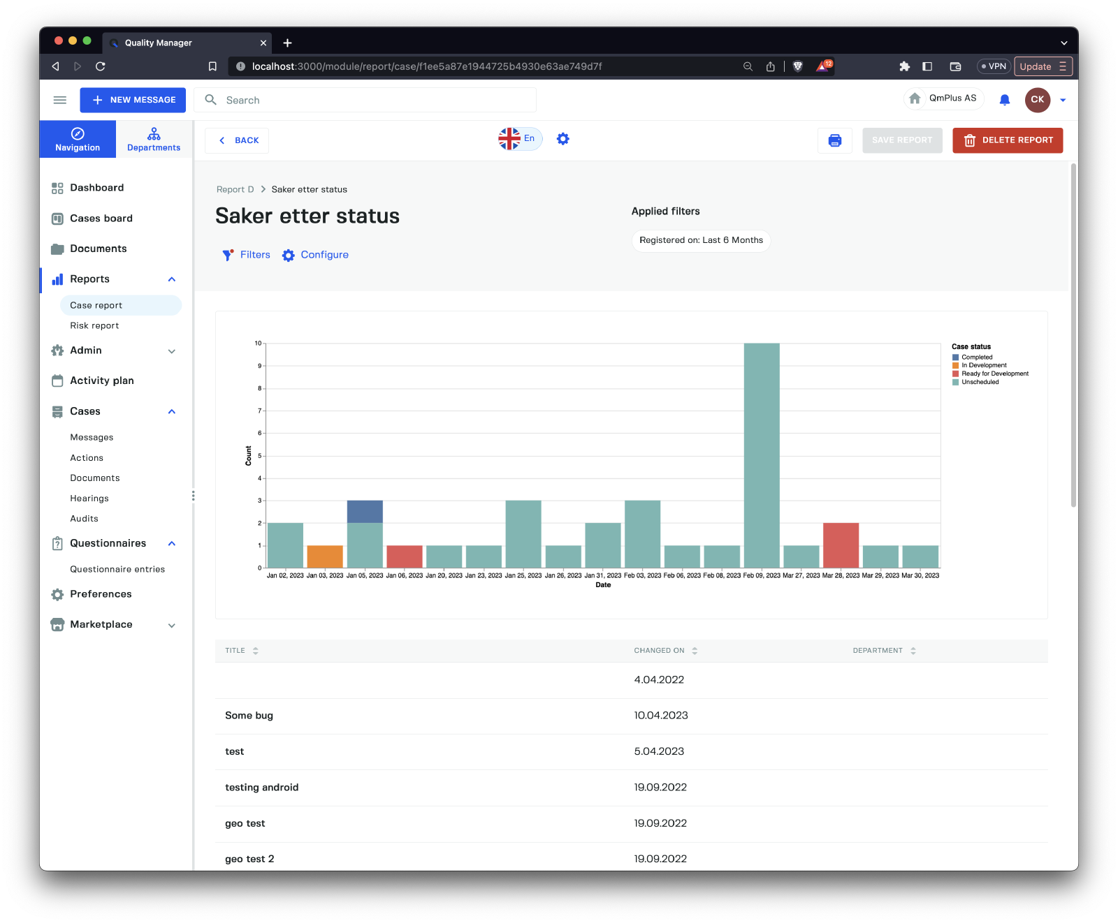
Clicking on the Zoom into results icon will display the complete list of all the data associated with the graph component, allowing you to explore the cases that make up the data.
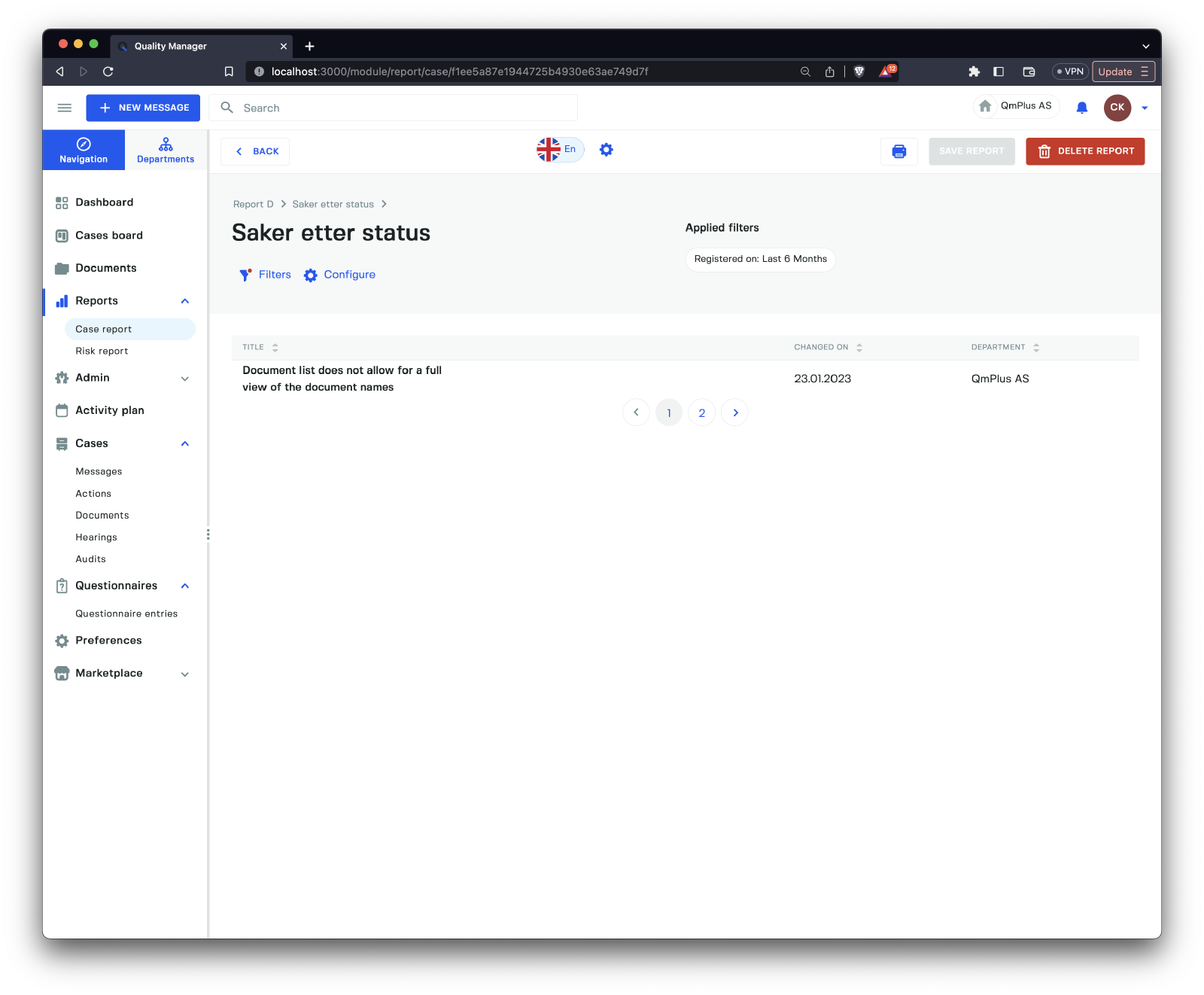
Clicking on one of the segments of the bar graph will zoom in and show only the cases that make up that bar.
Editing Report
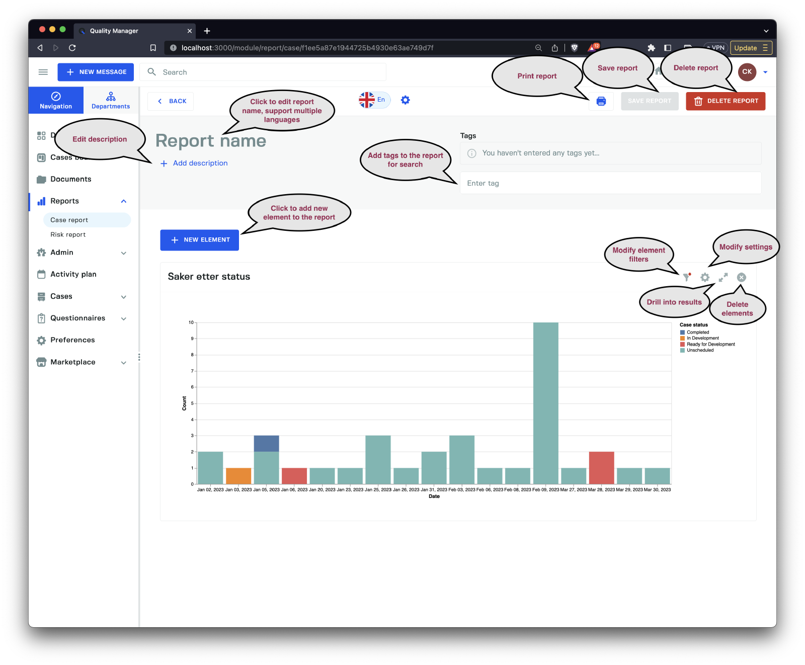
When editing or creating a new report, you need to provide a Report name before saving. You can also set a description for the report and add tags to group reports by keywords.
Adding elements to the graph lets you build a graph representing multiple analytic components.
There are two main report types.
| Type | Description |
|---|---|
General chart | A general report element chart. |
Predefined charts | Pre-defined reports allowing for specific report elements. |
DONE
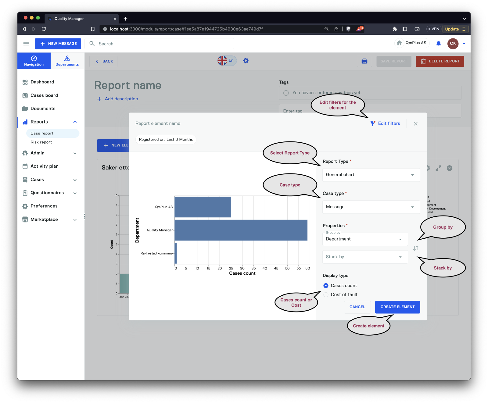
When editing or adding a new Element to a report, you have the following options for a General Chart.
| Option | Description |
|---|---|
Edit filters | Edit the filters used to limit the data used for the graph. |
Report Type | Allows the user to switch between a General chart or Predefined chart. |
Case Type | Choose the type of case to use for the graph: Message, Action, or Document. |
Group by | Select the field to group by. |
Stack by | Select a field to stack by. Status, Priority, Category, Category group, or Form. The available fields will depend on the Case type selected. |
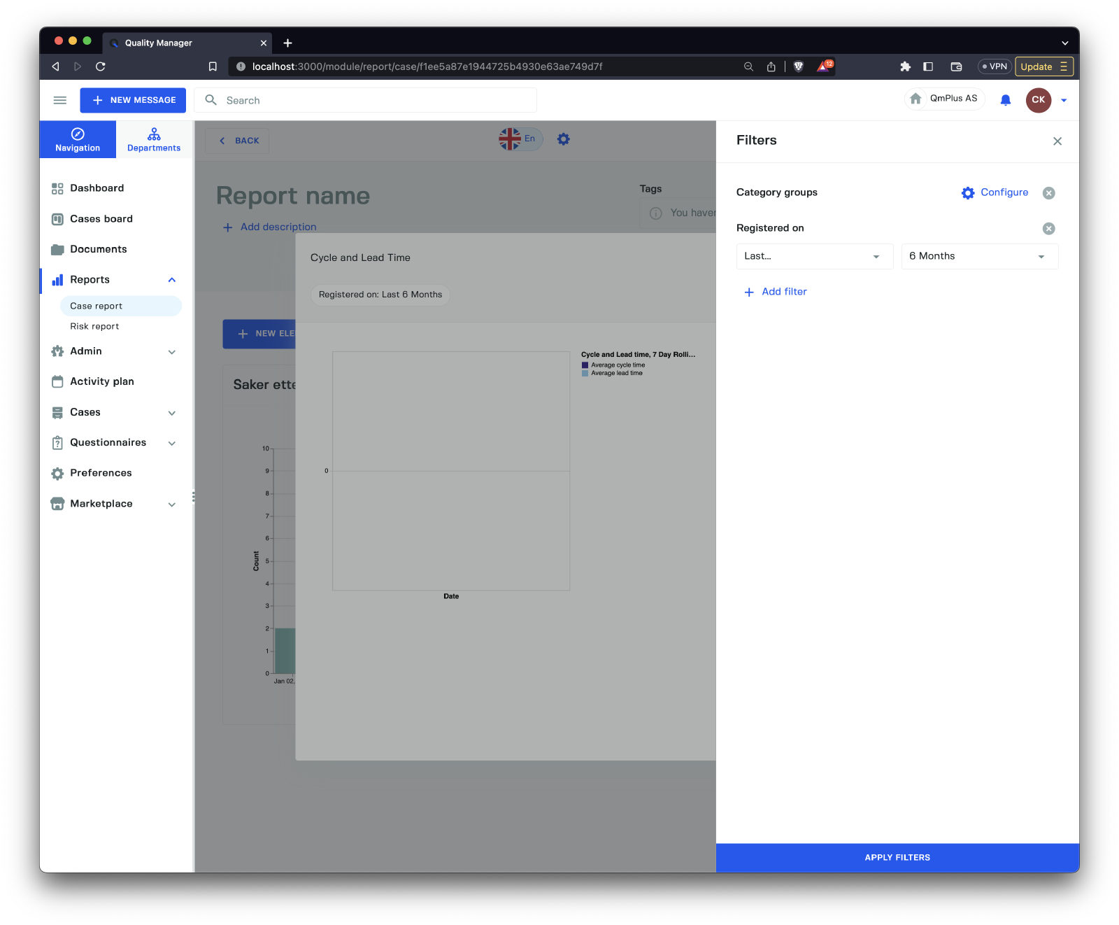
Editing the filters will bring up a sidebar where the user can modify the filters used to slice and dice the data for the graph.
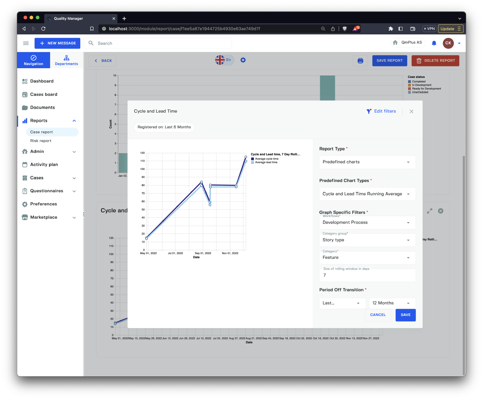
If you select the Predefined charts option from the Report Type dropdown, you will see a form like above. Depending on the type of Predefined chart, the user will have options available to tweak the results of the report element. The available Predefined charts are:
| Predefined Graph | Description |
|---|---|
Cycle and Lead Time Running Average | Measure the cycle and lead time over a window of running average. See definition of Cycle and Lead time below. |
Case by case status group | The count of cases over time by case status group. |
Cases by case status | The count of cases over time by case status. |
Unprocessed vs Open and Closed cases | Number of cases unprocessed, open, and closed over time. |
Time spent in case status group by percentile | Time a case spends in each case status group (setting the percentile; for the definition of percentile, see below). |
Time spent in case status by percentile | Time a case spends in each case status (setting the percentile; for the definition of percentile, see below). |
Cumulative count of cases by department | Cumulative count of cases per department. |
Cumulative cost of cases by department | Cumulative cost of cases per department. |
Definitions
Cycle time refers to the average time taken to complete a single unit. Lead Time refers to the length of time it takes from the date of receipt of an order to the date of delivery.
Percentile is expressed as the percentage of values in a set of data scores that fall below a given value. That is to say that if you set the percentile to 90% and you get a value of 100, it means 90% of the results in your data set fall below 100.
DONE
Risk Report List
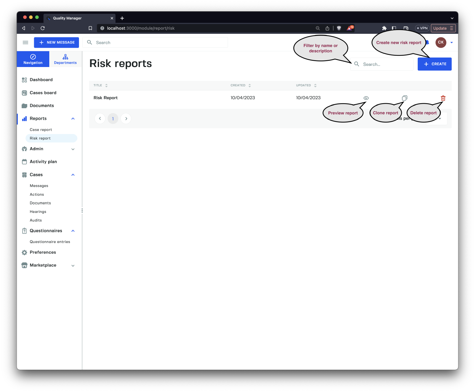
Clicking the Risk Report link brings you to the list of Risk Reports in the system. Risk reports are reports that report against a specified Risk model, allowing us to drill into Messages that have risk category groups associated with them.
Clicking on the Preview button of a Risk Report will bring up the preview of the report.
Preview
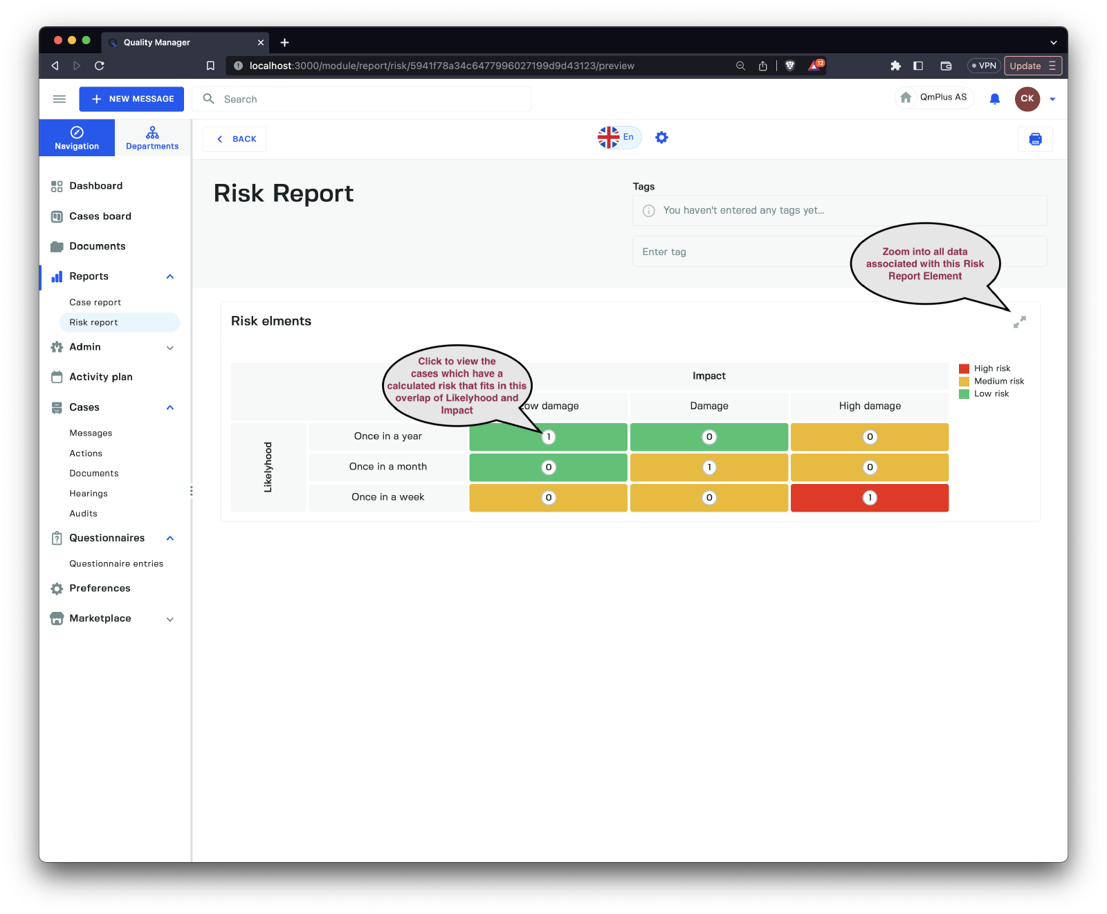
Clicking on the boxes in the rendered risk model takes you directly to the cases associated with the factors of the risk model, allowing you to investigate the associated cases within the specific report.
Editing Report
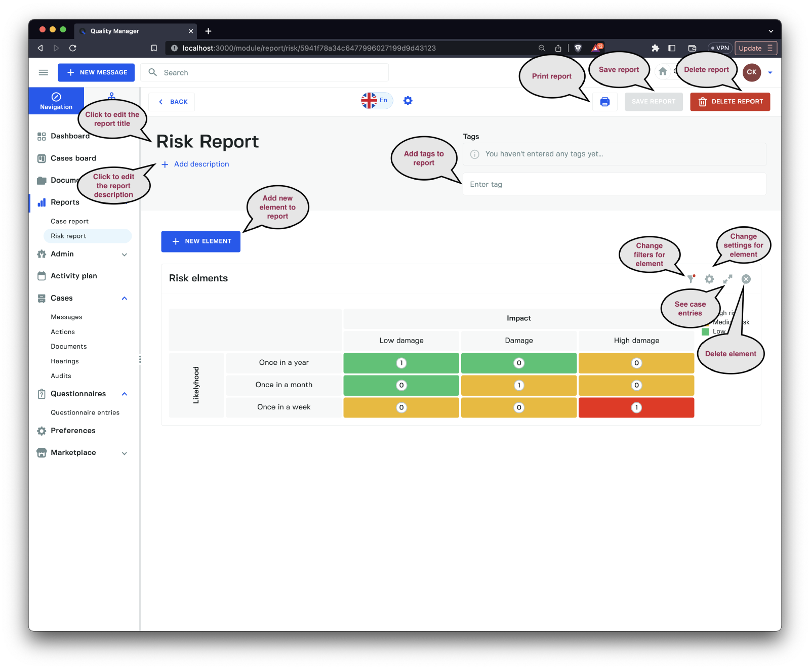
When editing or creating a new report, you need to provide a Report name before saving. You can also set a description for the report as well as add tags to group reports by keywords.
Adding elements to the graph lets you build a graph representing multiple risk analysis components.
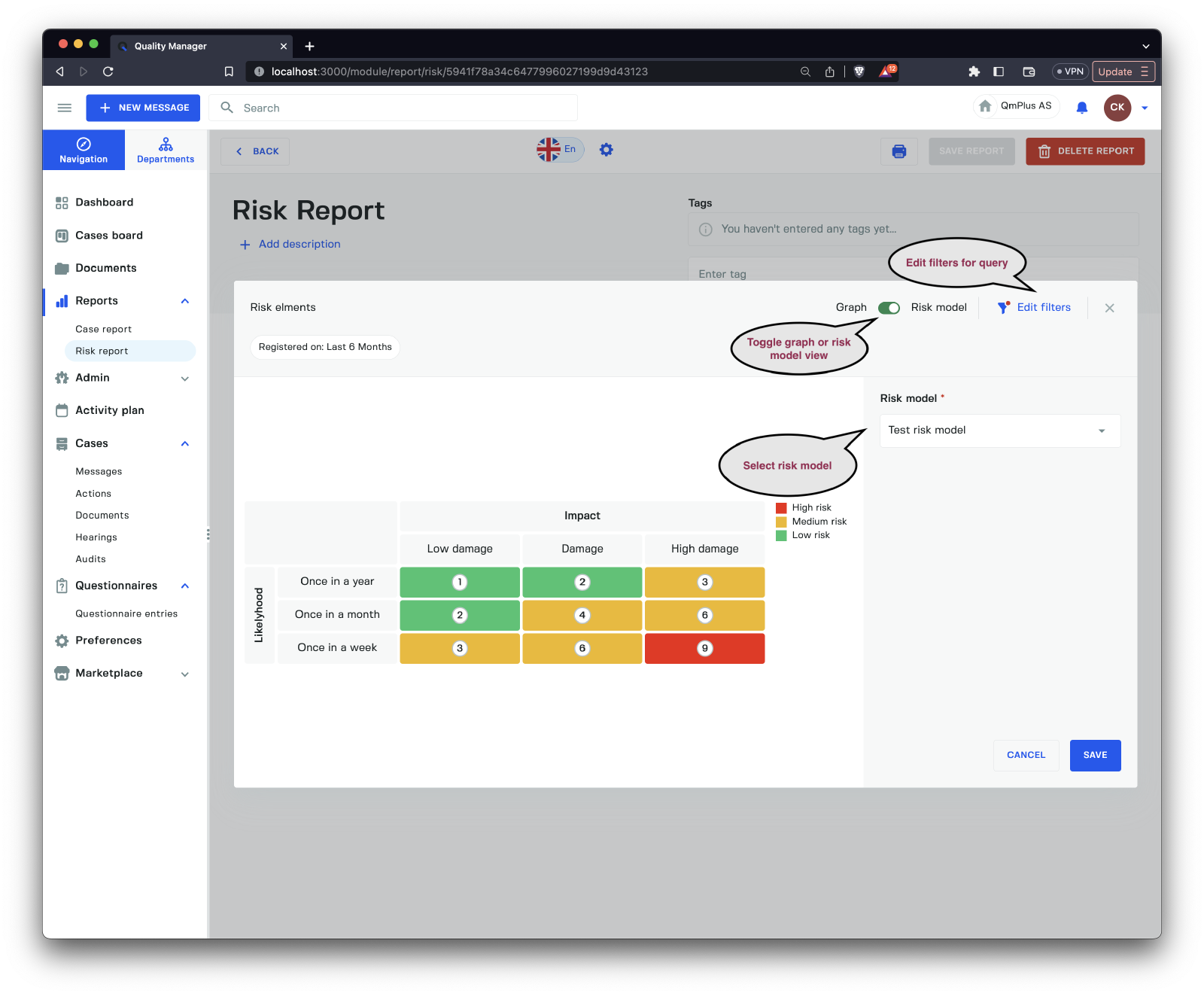
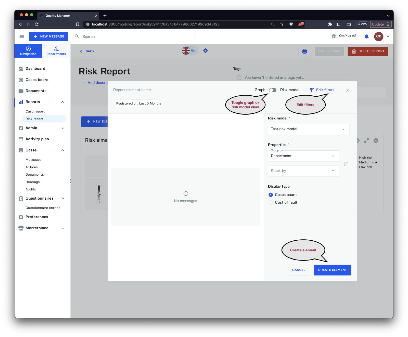
Looking at the Add Risk element interface, we can see the following options when the Graph / Risk model toggle is set to Risk model.
| Option | Description |
|---|---|
Graph / Risk model toggle | Toggle between graph or risk model view. |
Edit filters | Adjust the filters to filter down the results. |
Risk model | Select the risk model to use for the graph. |
Looking at the Add Risk element interface, we can see the following options when the Graph / Risk model toggle is set to Graph.
| Option | Description |
|---|---|
Graph / Risk model toggle | Toggle between graph or risk model view. |
Edit filters | Adjust the filters to filter down the results. |
Risk model | Select the risk model to use for the graph. |
Group by | Group by field: Department, Status, Priority, Category, Category group, Form, Year, Month, Date, or Risk level. |
Stack by | Stack by the following field: Status, Priority, Category, Category group, Form, or Risk level. |
Display type | Select the display type: either Cases count or Cost of fault. |